(UX + front-end project, website)
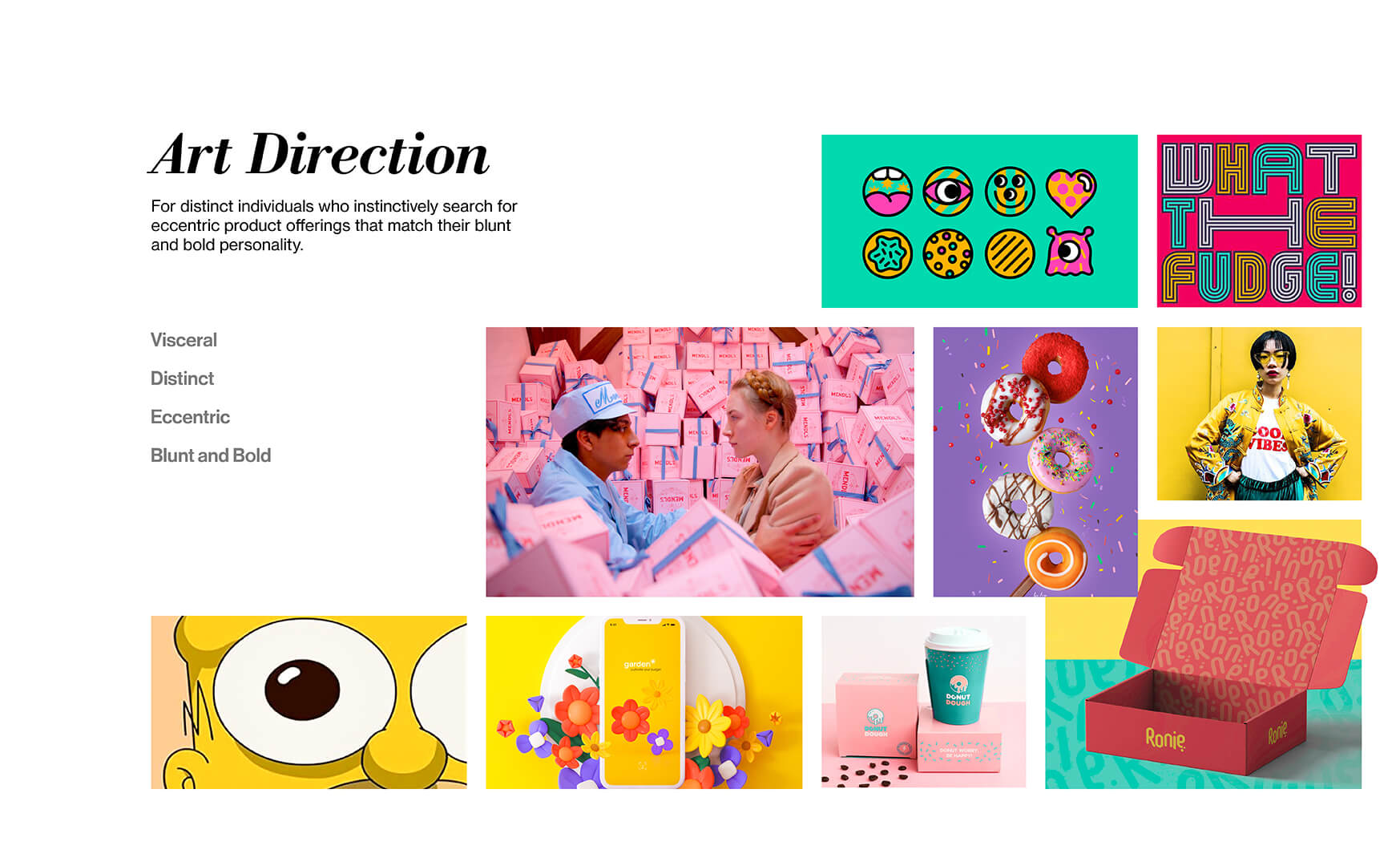
Dipp’d is a donut shop in Toronto that specializes in creative flavours and caters to audiences of all ages. Dipp’d is looking to scale their store and reach a larger audience through an online platform to be able to deliver their products within their local city. They aim to provide quick and sweet pick-me-up donuts for distinct individuals who instinctively search for eccentric product offerings that match their blunt and bold personality.
Click here to view the website.Interaction Design + UX Research + Front-end Development
12 Weeks

Handcoded website (Walkthrough)
Mobile Responsiveness (Walkthrough)
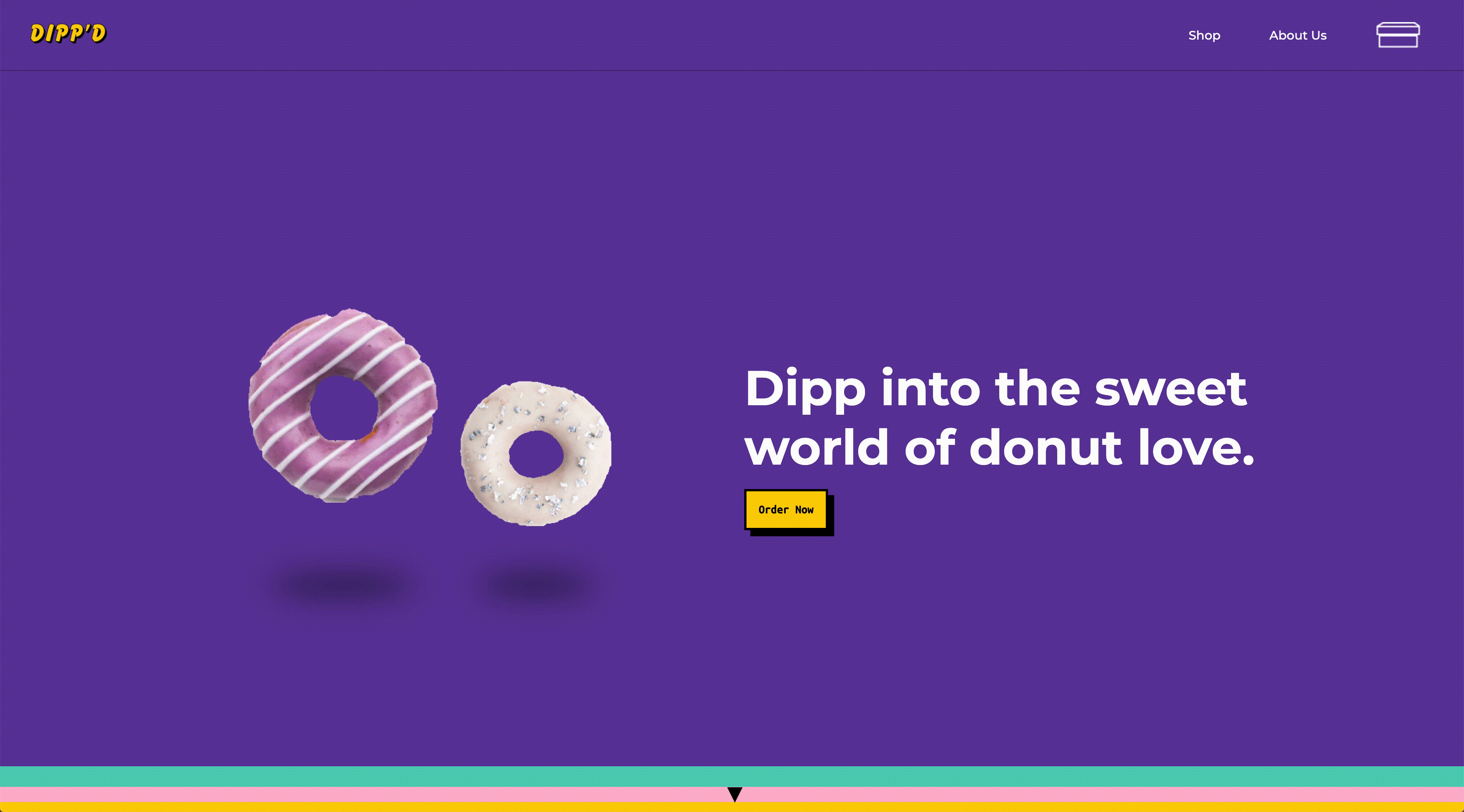
Dipp'd is a self created client based in Toronto, Canada that specializes in selling distinctive donuts of creative flavours and bold personalities for individuals in search of unique donuts to match their personalities.
With their brick-and-mortar store already having been established, Dipp'd is looking to scale their shop and reach a larger audience through creating an online platform for their customers to have easier access to pickup and delivery.
In order to meet the needs of our client and their audience, our team developed an Art Direction and Brand Strategy to create an online shop based on the UX Research done for the client and their users.
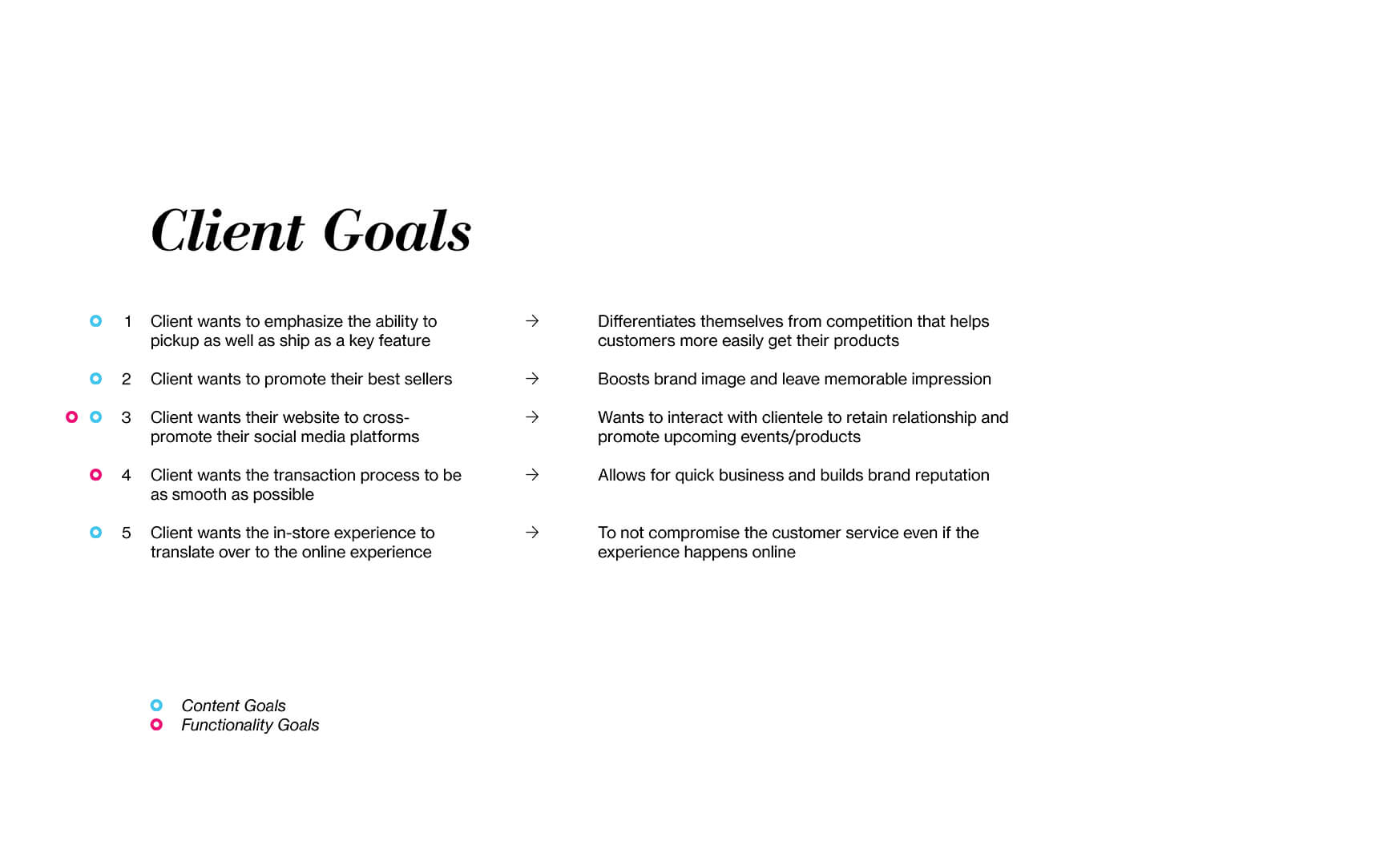
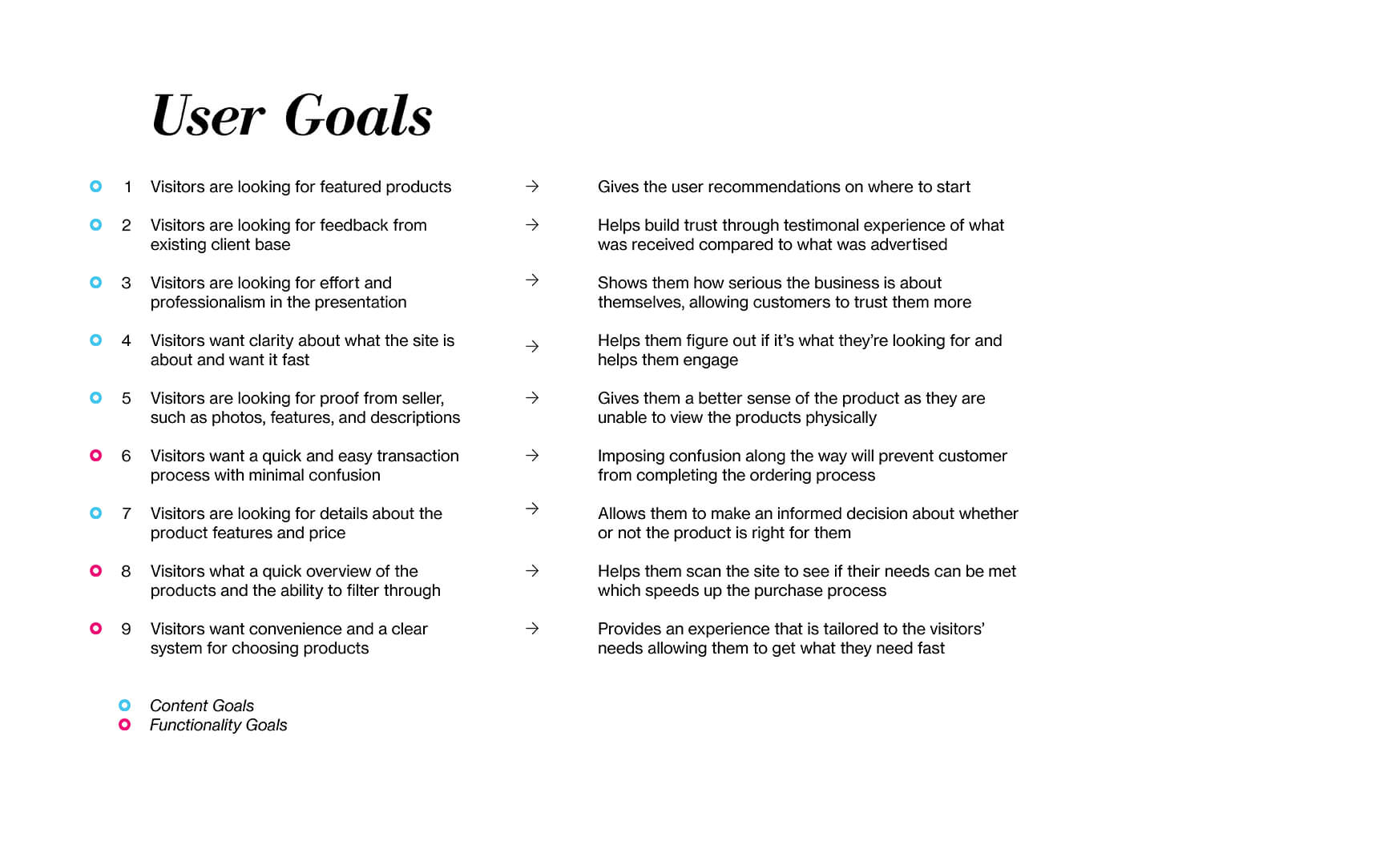
In order to frame the problem for this project, our team had to figure out the needs of both the client and their users. The client goals, which would normally be learned through communication, were created based around the fictional context of the business and the user goals were derived from Primary and Secondary Research done through a series of Surveys, Interviews, and Usability Tests with individuals of varying ages from 20 to 60.
A few of the precedent websites and companies that we conducted in our research include:
As a result, our team was able to create a balanced solution that addressed both the client and visitors' pain points. We iterated in a few directions before landing on an Art Direction that embraces both bold and expressive nature of the brand and their customers to meet the client's goal of a cohesive experience in-store and online.
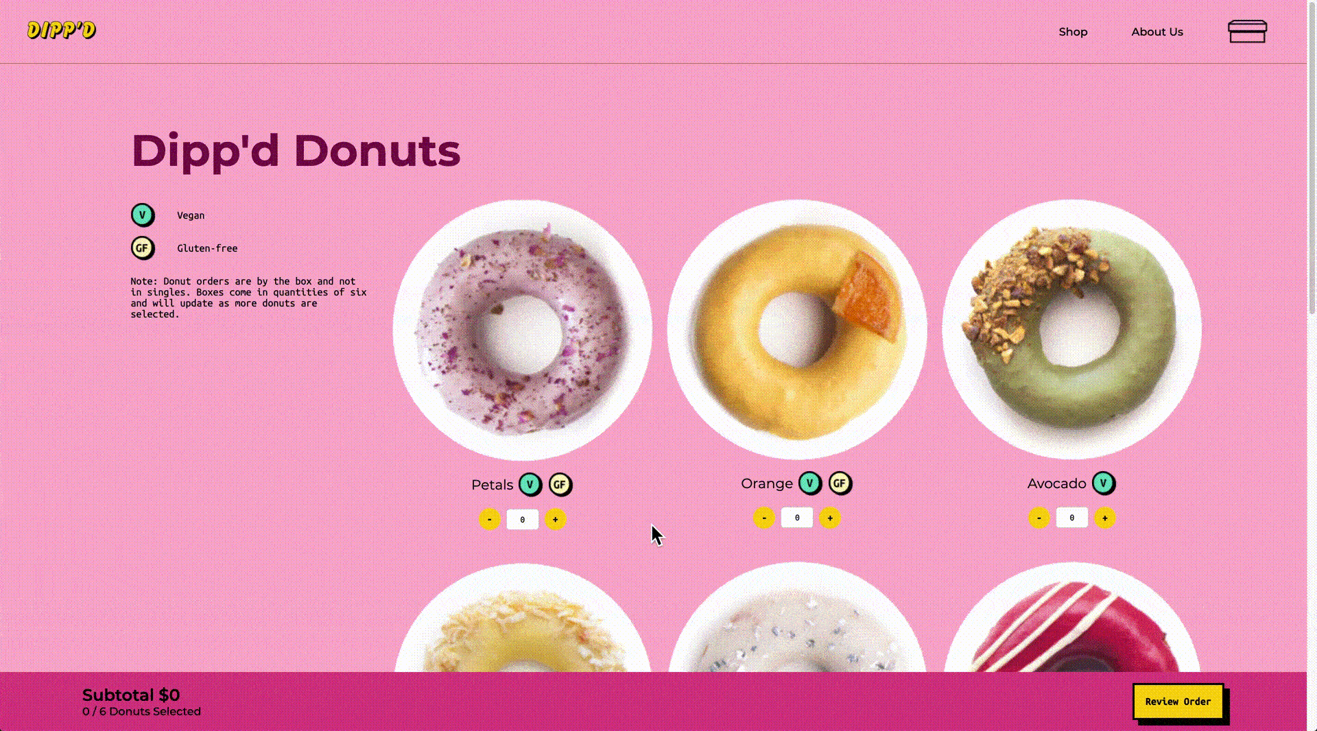
Colour was implemented in a Systematic manner to categorize the different types of pages and functions on the website.
A pattern library was created to aid the team during the development process and help keep everything grounded and consistent. Repeated modules, code snippets, site map, wireframes and mockups are included within the pattern library.
Click here to view the pattern library.The visitors are welcomed with a splash of colours to introduce the bold personality of the brand and to hint at the colour system behind the website.

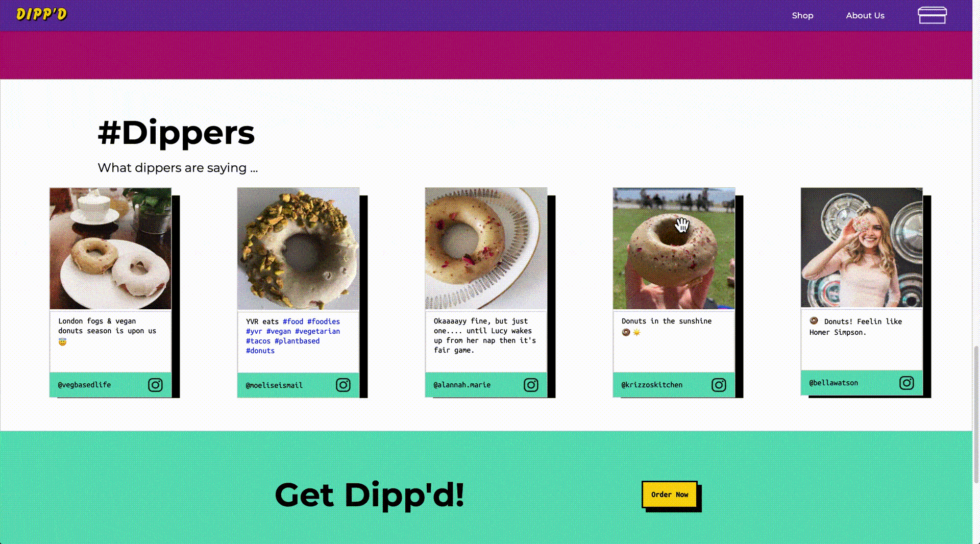
Testimonials and customer reviews are shown here in the form of a draggable carousel to give visitors a sense of trust through the engagement and social proof of an existing pleased client base.
The essential product information is presented through a hover interaction in order to give the visitors a quick overview of the products.
Not only did this project teach me the hard skills of front-end web development, but it also gave me a new perspective and understanding which I consider very valuable as a UX designer. Having a diverse understanding and awareness of different people's frameworks will help me think in an empathetic and comprehensive way to create ethical solutions for the benefit of many people.
I also want to thank my teammates Joanna and Jonathan for being there for all 12 weeks from ideation to execution. Through working with them, I was able to further develop my soft skills and work as a team to tackle the project.